
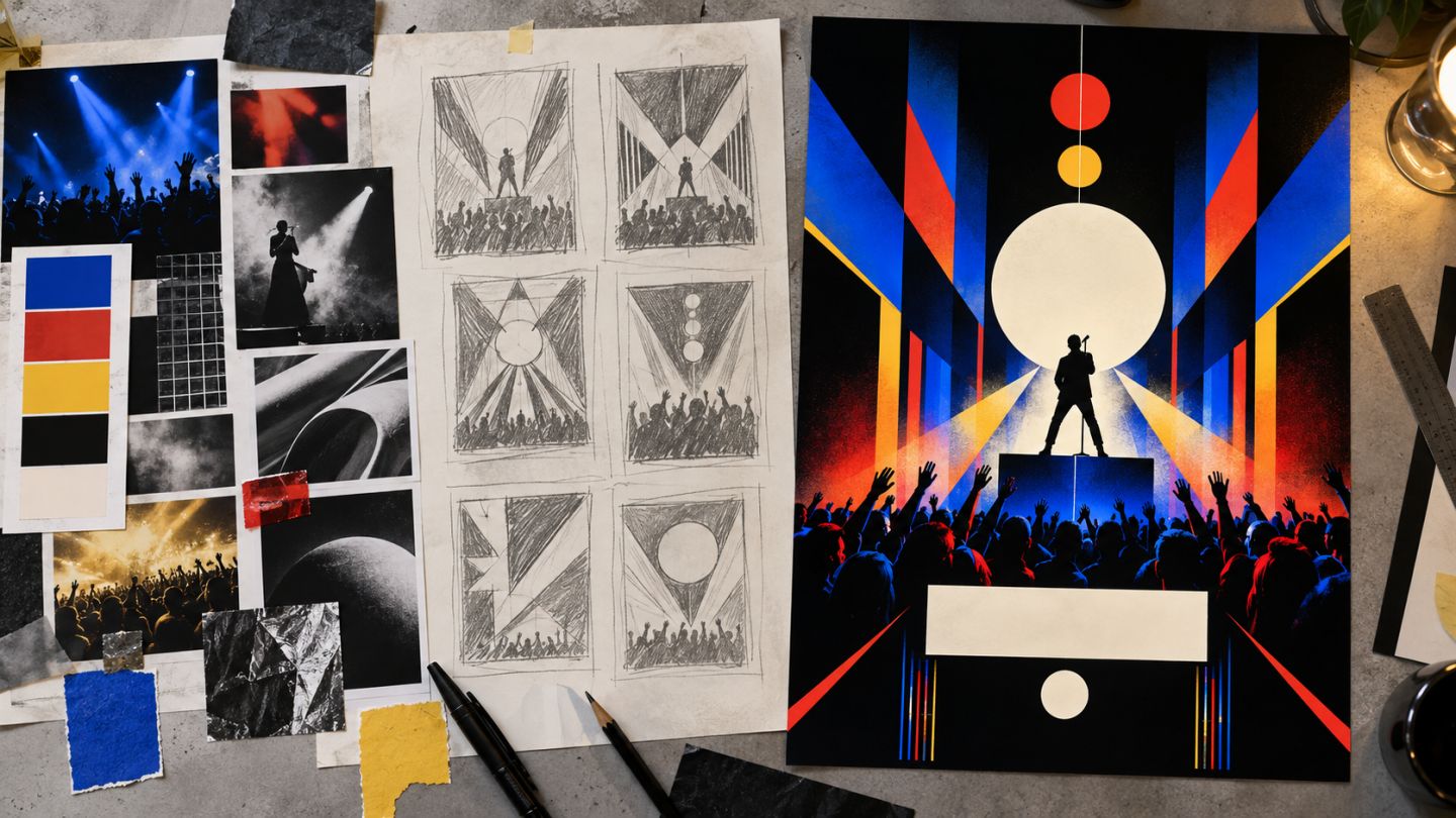
A poster must attract attention from a distance and reveal useful information up close. A strong workflow begins with message and hierarchy rather than effects.
Collect required content
Confirm event name, theme, date, venue, CTA, organizer, partner marks, and mandatory terms. Determine web or print output because dimensions, color, bleed, and resolution differ.
From moodboard to thumbnail
- Build a focused moodboard for mood, color, imagery, and type.
- Write one sentence describing the concept.
- Sketch at least six small monochrome thumbnails.
- Select two with the clearest hierarchy.
- Test color and type before refining detail.
Three viewing distances
| Distance | What should be visible |
|---|---|
| Far | Main visual or event name |
| Medium | Date, theme, lead performer or speaker |
| Near | Venue, CTA, marks, and secondary information |
Build the Photoshop file
Use guides for margins and bleed, Smart Objects for images, and groups for Background, Visual, Type, and Sponsors. Keep text editable. Match light and color in composites before applying decorative texture.
Typography and rhythm
Limit the design to two font families or one family with several weights. Create contrast through scale, weight, and spacing instead of many styles. Align deliberately and protect whitespace around essential information.
Preflight
- Verify copy against the official source.
- Confirm image resolution at final print size.
- Follow printer requirements for bleed, safe area, and profile.
- Preserve an editable PSD and deliver the requested PDF/TIFF/JPEG.
- Create a separate lightweight sRGB web version.
Effects matter only when they clarify the concept. With weak hierarchy, more effects usually reduce readability.
Practice exercise
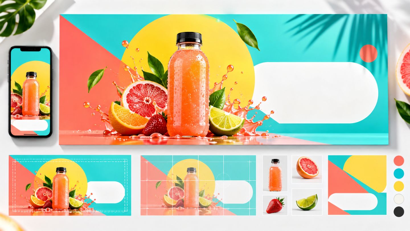
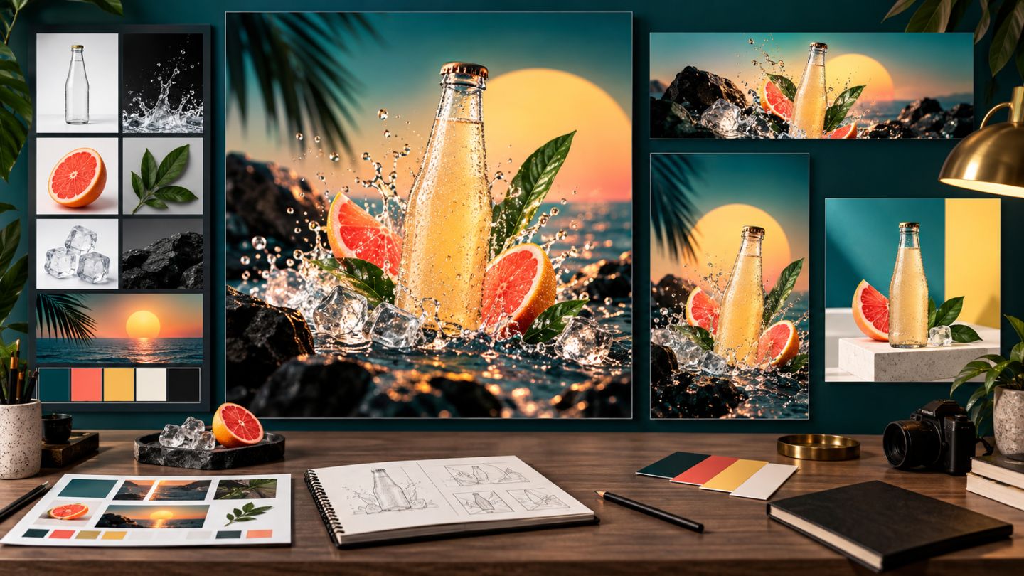
Design a poster for a fictional event. Produce a moodboard, six thumbnails, an A3 print version with bleed, and a portrait social version. Review both as small thumbnails.

No comments yet. Be the first to share your thoughts.