
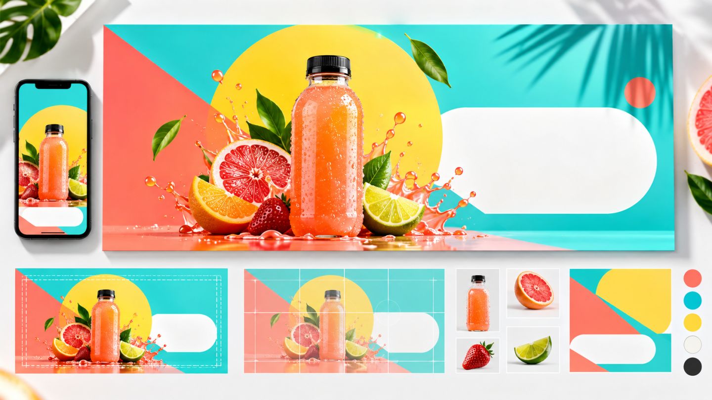
An effective banner communicates one message in seconds and remains readable on a small screen. Photoshop is the production tool; the critical decisions are brief, hierarchy, and adaptation across ratios.
Define the brief
- Goal: awareness, engagement, or conversion.
- One primary message and desired action.
- Audience, tone, and brand system.
- Current platform placement and dimensions.
- Required assets and legal copy.
Content hierarchy
| Level | Role |
|---|---|
| 1 | Attention image or headline |
| 2 | Benefit, date, or supporting detail |
| 3 | CTA, logo, and secondary information |
Design workflow
- Create the correct artboard and safe area.
- Sketch three monochrome thumbnails.
- Place images as Smart Objects.
- Build hierarchy through scale, contrast, and space.
- Limit fonts and colors to the brand system.
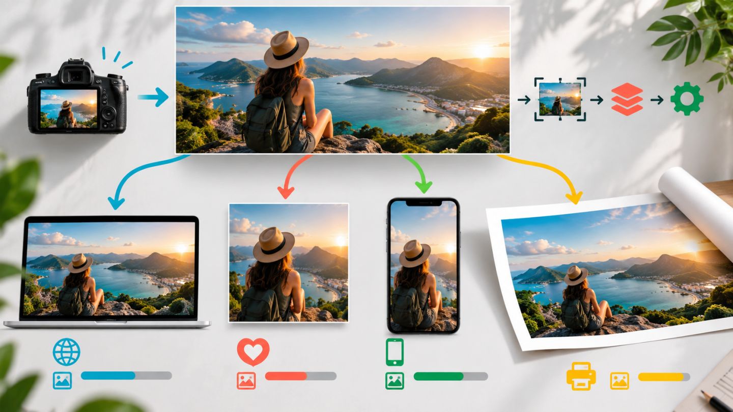
- Recompose each ratio instead of cropping mechanically.
- Review at actual mobile display size.
Readable typography
Keep copy short, maintain contrast, and avoid placing type over busy detail. Do not shrink type merely to fit more words; move explanation into the caption or destination page.
Reusable file structure
Group Background, Product, Copy, CTA, and Brand. Use Smart Objects for replaceable assets and name artboards by channel and dimensions.
Export checklist
- Correct ratio and safe area.
- Verified spelling, dates, prices, and CTA.
- Undistorted logo with clear space.
- sRGB color and appropriate file weight.
- JPEG for photographic content; PNG/WebP when transparency or requirements call for it.
A banner does not need to tell the whole story; it needs to make the most important point immediately clear.
Practice exercise
Design one product campaign in landscape, square, and portrait ratios. Preserve hierarchy while adapting position, crop, and whitespace for every artboard.


No comments yet. Be the first to share your thoughts.